2013/09/17

Finally!

 I finally got to my easel tonight!  I think the "Coq Bleu" might be done.  Ala Prima from a photograph I took at John Traynor's open house.  I don't know whether this rooster is anatomically possible, but I like the energy of the colors and brush work.  8 x 10 oil/canvas
This needs just a bit more detail.  (Also 8 x 10).  Amazing to me how much faster a smaller painting goes after getting used to the larger ones! The sky and clouds aren't reading "right" but I don't know that I much are.  I do want window sashes and shutters, though, and the flag and hanging baskets.
Here's the reference photo:  a home in Kingston, NH.


I also did a little bit of fussing on this one, which I am planning to enter into the NAA Member's Juried Show.  Even if the juror doesn't like it, it was felt more ambitious than anything I've tried before.
 And the "left overs" panel.  Sometimes I knife the paint left over on my palette onto a board or canvas.  Upon turning this one upside down and around... I'm thinking It may have a life as a cat.  What do YOU see?!!


2013/09/15

Photographic Reconnaisance


I find it a little strange that I wanted to take photographs of different subjects to paint with pastels. Perhaps that is because I have seen so many pastels of marshes, water and green things.  So I headed out towards Rockport, MA (on Cape Ann) to see what I could see.  I think the tide was mostly out, so the water, sand and marshes had lots of textures.  The little green trimmed white "house" actually seems to be floating on a platform of some sort;  a rather literal house-boat perhaps.


Some of the pictures will require thoughtful cropping.


I have already "moved" the boat leftward with Photoshop, so that unlike real life, it wasn't directly aligned with the house
Furthermore, I must remember NOT to go on Saturdays!  The town and Bear Neck was jam packed; there were even tour buses parked at the main intersection.  So I drove past the congestion toward the "Granite Pier" and took pictures there.  Below is NOT Motif #1, but perhaps Motif #X+1!!


The buoys and lobster traps were arranged haphazardly and mysteriously.  I can't decide which crop I like best.  I posterized the one on the far right.  It may make a decent abstract.


I don't often see boats with tall masts UNDER a house.  Intriguing.

Another composition that might work in pastels, although there might need to be a shift in the clouds to avoid having it be one giant series of diagonals.
I had no idea how small the fisherman would look.  If I gave him a brighter jacket he would definitely become a focal point.

Below left is Rockport seen from across the bay.  Don't know where the focal point would be.
The right hand  image was intended to focus on the waves breaking on the rocks... Can't believe I didn't "keep" the buildings' roofs in the frame.  Eek.

Almost identical degrees of posterization.  Even if I TRIED to do one rather than the other, I'm sure that a transition to pastels would be different in another way.
Abstract fodder. Perhaps for oil paint and palette knife.


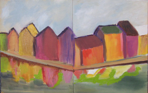
Who knew that the houses painted ORANGE would actually match the trees in September?!  Might add some green in the foliage and make the granite and sky different shades of purple/lavender to do a painting all in secondary hues.
Clouds were often perfectly composed.  I've looked at clouds from both sides now... and have very little clue as to how to paint them.
The owner of this house near Ipswich must care more about the inside than the outside.  Looks ready for squatters or haunting soon.
Benjamin Grant House  ca. 1735
Asymmetrical geometry of New England buildings fascinates this California "girl."  (Not to mention the orange trim and great cascade of blossoms.)
The Whipple House ca. 1677
This is either a museum or historical site in Ipswitch.  (This view is end-on of the descriptive sign.)  Note the stocks in the left foreground.  Puritanical much?

2013/09/12

So far, I'm not in love

with pastels, that is.

Last night, through the generosity of Lisa Mitchell at Mountain Inspirations, I sat in on an on-going pastel painting session in North Hampton.  She lent me a paper prepared with Acrylic Gesso for Pastels and access to her substantial pastel pallette.  I stuck mostly to my small collection of Rembrandts and NuPastels.

I totally understand now that whoever has the most pastels wins!  At least with pastels.  I also understand the lure of the Terry Ludwig brand (SO soft!), and TL's Maxine Price shades or gray (more than 50, I'm sure).

You'd think that something that looks like chalk/crayons would be easy.  You'd be wrong.

But curious.  Even if dusty.

2013/09/08

Sketchy (Re)Start

This is a "sketchy" start, in more ways than one.
I promised an online-artist friend that I would start an art blog before the end of the weekend.  Officially, it is Monday, but I haven't been to bed  yet, so I hope this counts.

Above is an experiment with two smallish new boxes of pastels:  Rembrandts and NuPastels.  I've signed up for a class beginning next month.  I don't know that I really want to "switch" to pastels, but I love the way pastel artists use color, squiggles and strokes.  Surely I can learn to do some of that with oil paints!  Or encaustic! or mix all sorts of media together.

So I've started. If I find an economical venue that works better for a "gallery" for work better than Blogspot, I'll let you know.

By the way, I have two paintings in the Newburyport Art Association Members Show which opens September 14, 2013.

And I sold a painting at the 8 cubed show last month.
Rack 'Em Up
 Thanks for reading!


2012/03/12

Diptych of Overpainting

Diptych of Overpainting by Sultry
Diptych of Overpainting, a photo by Sultry on Flickr.

I'm trying NOT to create more paintings that would need to be crated and shipped... since they aren't selling. So these canvases (same size) are "re-cycled," i.e., painted over. Originally, they didn't look much like each other. I am trying to create some unifying shapes, motion and colors.

Geographical Impossibility

Geographical Impossibility by Sultry
Geographical Impossibility, a photo by Sultry on Flickr.

These two bits of landscape are not adjacent in reality. One photographic reference was shot in Norway and the other was taken in Germany. The construction styles and materials are different. One set of buildings is on piers over the sea. The other is on solid ground behind a sea wall. Artistic license is very helpful when it comes to making a whole that goes together better than its parts.

2012/01/23

Cavorting 1

Cavorting 1 by Sultry
Cavorting 1, a photo by Sultry on Flickr.

This painting is SO abstract it makes a good projective test!
What do YOU see?

2012-01-23_14-29-14_478-w

Mutton Trio

Mutton Trio by Sultry
Mutton Trio, a photo by Sultry on Flickr.

I think my sheep look like they have pipe-cleaner legs, charming though they may be. Perhaps I'll get a chance to see and study REAL sheep closer up and soon. I do think these guys would be more fun to have a beer with than any of the GOP presidential candidates, however.